«Triptea»
Brand development and packaging of tea «TripTea»
At the heart of a brand communication there is an idea of travelling to exotic countries of the world, which gives us TripTea tea and opens up a new world of flavor, each one with its unique package.
Cresta
Awards
Finalist International Advertising
Festival
New York
Golden
Hummer
Finalist
International Advertising
Festival
Latvia
Golden Drum
Finalist
International Advertising
Festival Slovenia
ADCR Russia
I Place.
International Advertising
Festival
Russia
White
Square
I Place.
International Advertising
Festival
Belarus
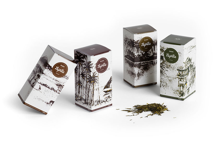
Since the brand, its communication and packaging were designed simultaneously, the semantic component was reflected in all cells at once. Naming of the brand was based on two strong assosiations: firstly TripTea is a tea travel, and secondly TripTea tunes into
a familiar and figurative word «triptych» — three-part painting, that reveals completely one key message in different subjects.
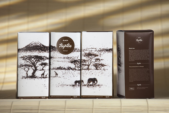
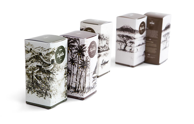
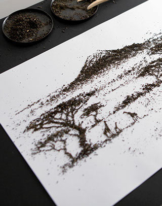
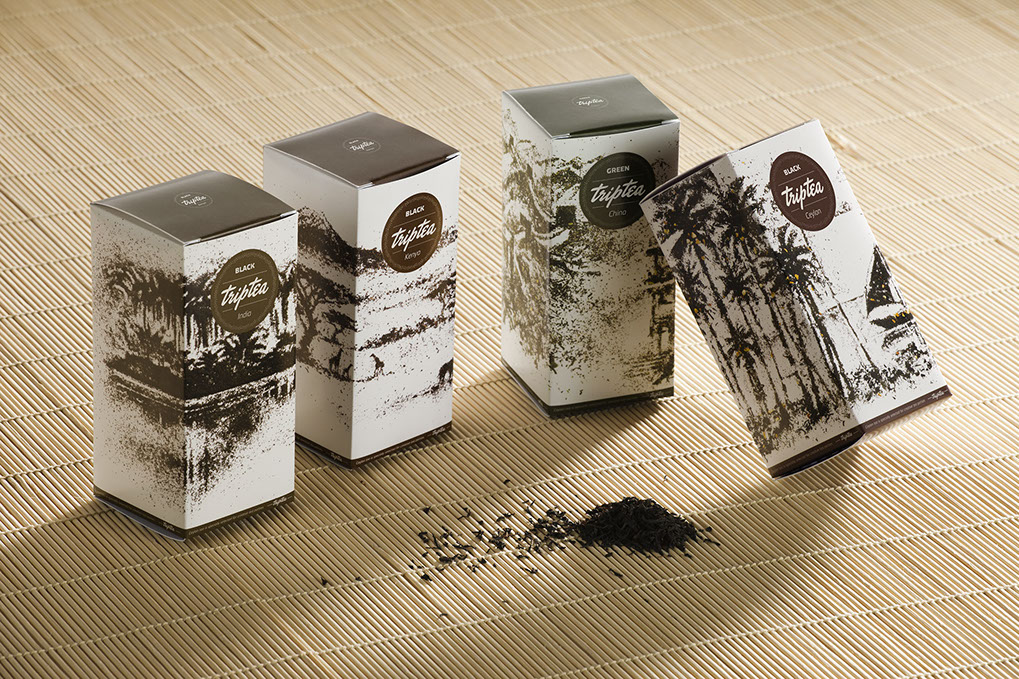
In developing the package this principle is also embodied. We wanted to show the beauty, depth and fullness of the tea. Therefore packaging was decorated with landscapes of countries where tea was assembled and produced. All landscapes are handmade directly of the tea variety from the package. This conveys an exotic image of the county as well as the richness of flavors and nuances of the product itself.

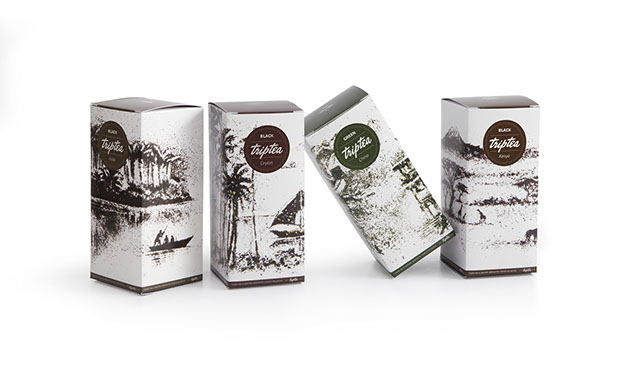
Besides the packaging reflects the meaning of the brand name – each side of the package has one of the lanscapes of the tryptich, that gives one an opportunity to present the product at the point of sale in an interesting and unusual way.
As a result we managed to capture the spirit of adventure and to show an exotic
and unforgettable world of tea in all its colors.
favorites:
facebook:
e-mail:
telegram:
+79163403935
Skype:
yellowdraw